How to Make a Histogram in Excel? An Easy-to-Follow Guide
Priya Bhagtani October 19, 2022 0 COMMENTS
A histogram is a graph used to show the frequency distributions. It shows the frequency of numerical data using rectangles. The area of rectangles is proportional to the frequency of a variable. The width of rectangles is equal to the class interval. A histogram is the most commonly used graph when it comes to showing frequency distributions.
It is a graphical display of data using bars of different heights. A histogram groups numbers into ranges. The height of each bar shows how many numbers belong to each range. Histograms are used to graphically represent continuous data, such as time spent, height, weight, etc.
As you must be aware, Microsoft Excel is used to create graphs, pivot tables, and more. Histograms are also created in MS Excel for a variety of applications across industries. If you use Excel to save, organize, and analyze data to perform calculations, make predictions, and make decisions, then you might need to make a histogram in this spreadsheet program. In this blog post, we have shown how to make a histogram in Excel.
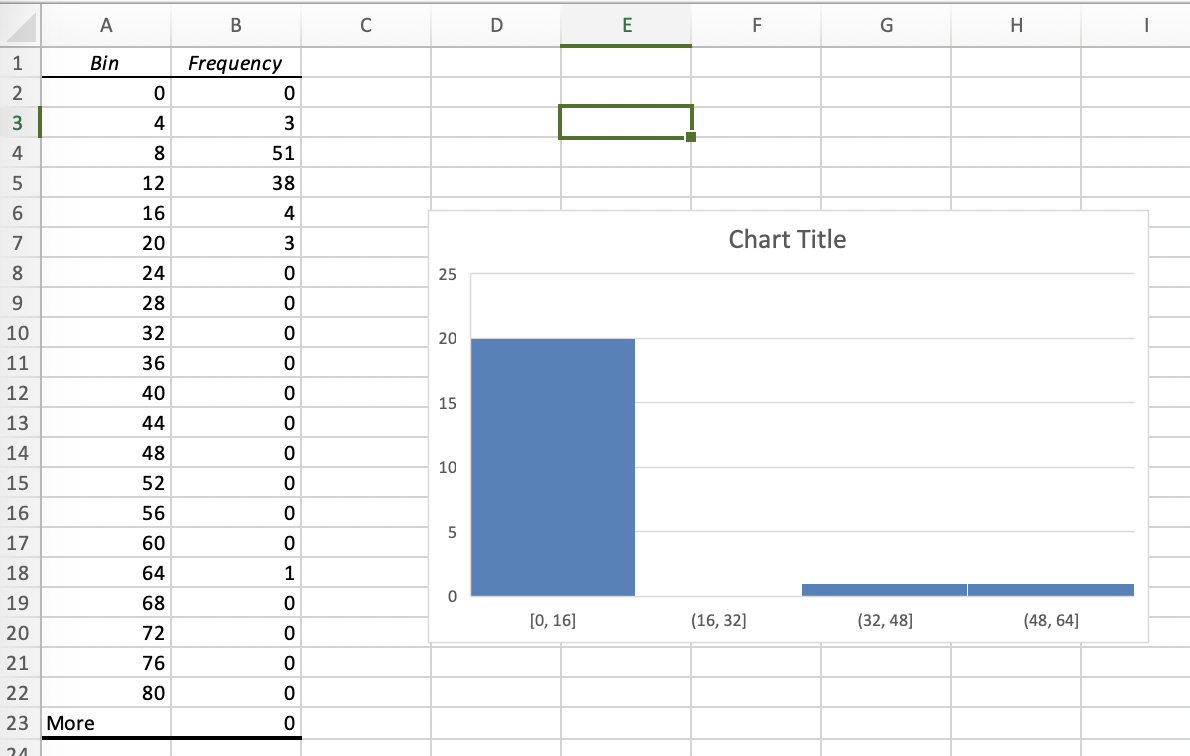
Table of Contents
How to Make a Histogram in Excel? Read All the Steps Here
A histogram is a widely used column chart to represent frequency data. It shows the frequency of the occurrence of a variable within the specified range. It organizes a group of data points into ranges specified by the user. Data points are taken and grouped into logical ranges or bins.
A perfect example of data that can be shown through a histogram is the salary earned by the employees of a company. A histogram can show the distribution of salaries earned by employees. When you create a histogram using this data, you will be able to see how many employees earn less than $5000, how many employees earn less than $10000, how many earn less than $20000, and so on.
Now that you know what the use of a histogram is, we are sure that you must have gotten more excited about learning how to make a histogram in Excel. Histograms can be created in the Microsoft Excel program on Windows computers, Mac computers, Android smartphones and iOS smartphones. They can also be created in the web version of MS Excel.
Creating a Histogram Using the Inbuilt Chart Function
If you are using the 2016 or higher version of the MS Excel program, you must know that it has a histogram chart as an inbuilt chart. You need to follow the steps mentioned below if you want to create a histogram chart in the 2016 or higher version.
- Enter the data for which you want to make a histogram in the Excel worksheet.
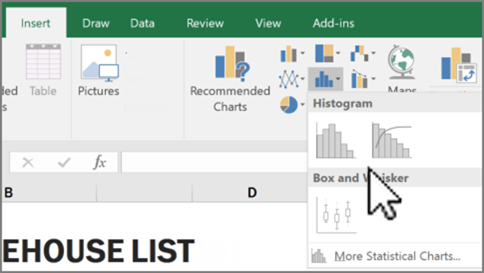
- Once you have filled in the data, select it, and click the ‘Insert’ tab from the menu options.
- Now click on the ‘Insert Static Chart’ option in the ‘Charts’ group.
- A drop-down menu will appear. You need to click on the Histogram Chart icon.
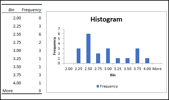
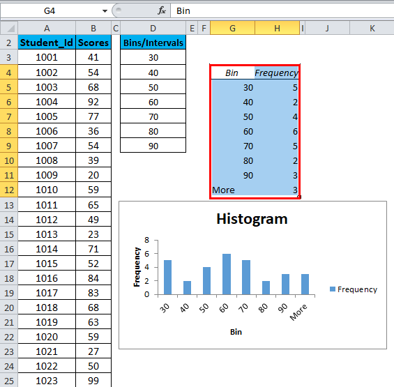
On completing the steps mentioned above, a histogram chart will be created in your Excel worksheet. In order to make a histogram, you enter two types of data in your file. The first type of data is known as the ‘Input Data’, which is the data you want to analyze with the help of a histogram. The second type of data is known as the ‘Bins’ or ‘Ranges’. Bins or ranges represent the intervals you want to use to measure the frequency of the data points.
Creating a Histogram Using the Analysis ToolPak
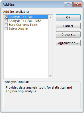
It’s worth mentioning here that you can create a histogram with the help of the Analysis ToolPak too. The Analysis ToolPak is an Excel add-in program or add-in feature. It consists of a variety of tools that enable users to perform data analysis for statistical, financial, engineering, and other applications. A histogram is one of the tools available in Analysis ToolPak.
If you want to know how to make a histogram in Excel using the Analysis ToolPak, read the steps listed below. First of all, you need to install this add-in feature. You can use this add-in program with all versions of the Microsoft Excel spreadsheet program.
- Open the MS Excel workbook and click the ‘File’ tab.
- Then, select ‘Options’ from the menu on the left pane.
- The ‘Excel Options’ dialog box will open.
- You will see several options in the navigation pane.
- Choose the ‘Add-ins’ option from the navigation pane.
- Go to the ‘Manage’ drop-down at the end of the dialog box.
- Select ‘Excel Add-ins’ and press the ‘Go’ button.
- A window will open that will show different Excel Add-ins.
- Check the box near the ‘Analysis ToolPak’ option and click ‘OK’.
When you complete the steps mentioned above, the Analysis ToolPak will get installed in the MS Excel program. You will be able to access it under the ‘Analysis’ group in the ‘Data’ Tab in your Excel workbook. You just need to use this add-in feature whenever you want to create a histogram.
Now, let’s see how to make a histogram in Excel with the help of the Analysis ToolPak.
- Fill the data in the Excel worksheet.
- You need to specify the bins or ranges separately.
- Now click the ‘Data’ tab and go to the ‘Analysis’ group.
- Click on ‘Data Analysis’, and a dialog box will open.
- Select ‘Histogram’ from the list in the dialog box.
- Then press the ‘OK’ button located on the right side.
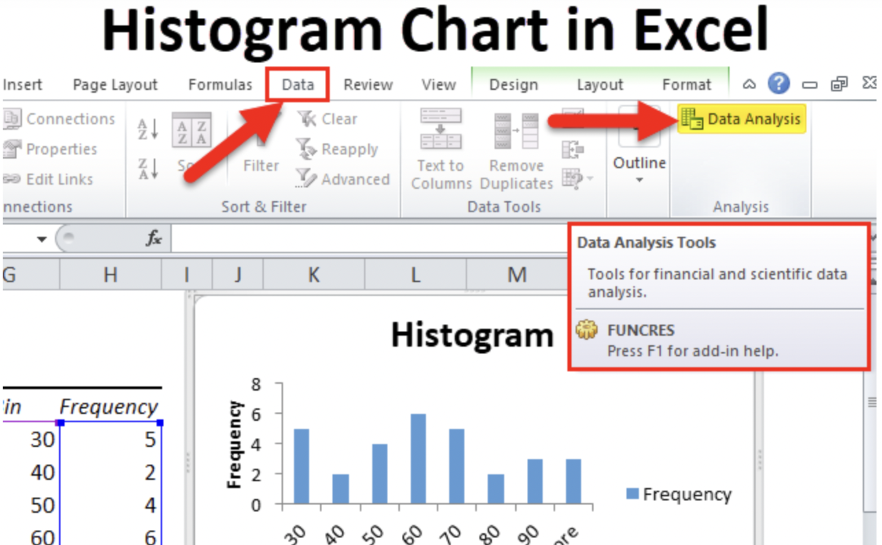 Image Credit: Studytonight
- The Histogram dialog box will open.
- You need to select the input range and bin range.
- Check the ‘Labels’ checkbox if you want to include labels.
- Choose the ‘New Worksheet/Workbook’ option to get a chart in a separate worksheet or workbook.
- If you want to get the histogram in the same worksheet, you need to specify the Output Range.
- In the end, you need to check the ‘Chart Output’ checkbox and click on the ‘OK’ button.
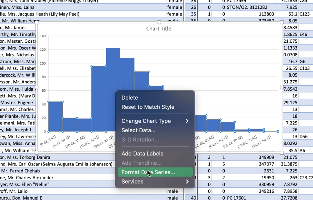
Now that you have learned how to make a histogram in Excel, you should also know that you can customize a histogram. You get a variety of options when it comes to customizing or formatting histograms in the Microsoft Excel spreadsheet program. You can add or remove labels, change the bin width, change the number of bins, change colors, and do much more. You can even change the title of the histogram chart.
Final Thoughts
A histogram chart in MS Excel can help you in many ways. Having the knowledge of how to create a histogram can prove to be beneficial. We hope that you would have liked reading this blog post.


Latest Articles
 Apkek Org Review: Free Ways to Earn Mone…In General
- A Long Walk to Water PDF: Summary, Chara…In General
- Model Xucvihkds Number Guide: Features, …In Technology
- How to Build a Successful Career as an O…In Technology
- Thesparkshop Review: Is It Worth Shoppin…In Technology
- Common Electric Bike Problems and Simple…In Automotive
- Igsty com How to Save Instagram Videos, …In Technology
- Bangkok Extradition Law Firms: How to Ch…In Law