
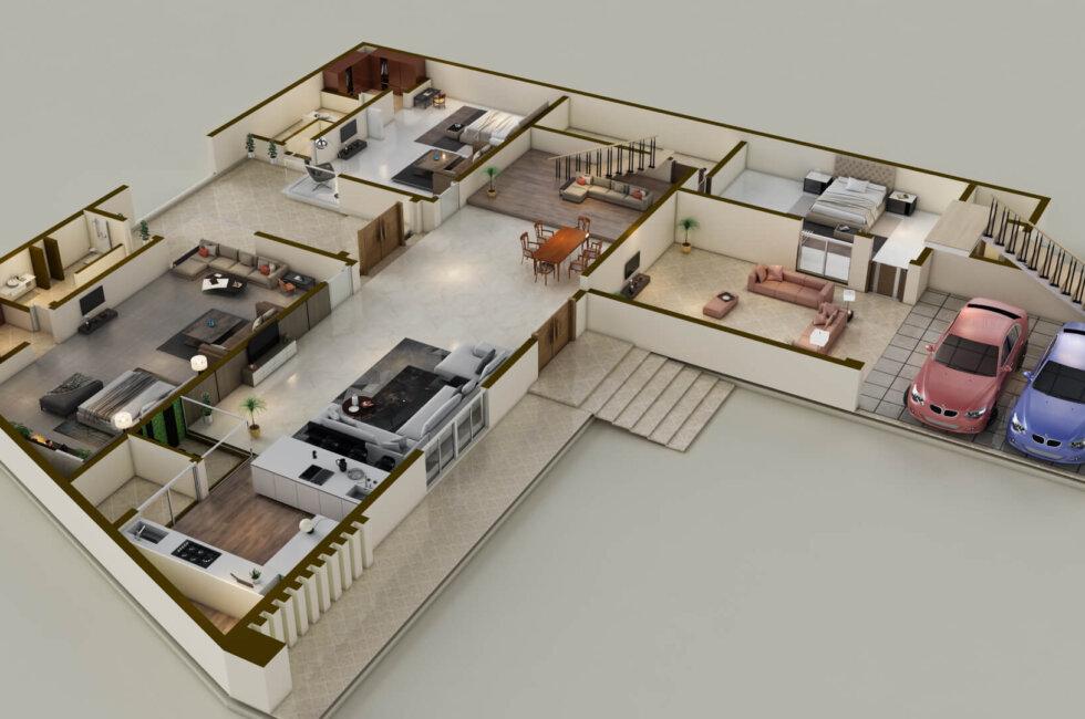
When you visit someone, what is the first thing you notice? You see the apartment’s owner by himself, who welcomes guests in the hall. After the greeting, the next words of the owner are an invitation to go to the room, but which one? Many rooms open from the hall. The invitation to enter is conveyed using the duty word for hospitality. And the doors leading from the reception room serve as portals that open access to the means by which the guest’s issue can be resolved. If you are hungry, you will be taken to the dining room. If you are here for business, you will be taken to the office.
The example of the start page of the site of our partner D.Works, an ux design firm san francisco, is a unique landing page solution. When you first visit this site, you find yourself on a page that resembles the hall of a house. A series of portals dynamically open from there. At the entrance to each portal, a solution to the problems faced by the client’s business is described. This offers you the option of choosing from a variety of portals through which you can use the tool to solve your problem. So, the landing page is like the hall room, from which many other rooms open. Solving your concern is like going from the hall room to another one.
Table of Contents
Landing page feature
Landing (also known as start page) is a special page, the task of which is to encourage the visitor to this page to perform a targeted action. This is one of the following:
- buy a product or service,
- register,
- subscribe,
- apply or fill out a form,
- learn more about the company – about the product or service.
It is assumed that the user who visits the landing page has already chosen a company that is ready to solve his problem. On the landing page, the user is offered the solution itself, to access which the user must perform the target action. That is, the visitor to the start page is already motivated enough to complete the target action — buy, subscribe, or fill out a form.
Start page category depends on the target action
Depending on the target action, landing pages can be conditionally divided into three categories:
- A subscription page.
It is a landing page whose task is to collect users data. To achieve this, users register and fill out various forms. The main element of the contact collection page is a button with the corresponding inscription – register, subscribe.
- A selling page.
It is a landing page that offers to purchase a product or service. The button inscription – buy or purchase.
- An information page.
This offers to take a targeted action – learn more.
The blocks that make up the landing
The magic of a landing page is its creativity that cannot be stereotyped. But we can still achieve consistency without affecting creativity. Landing pages, like any other web pages, consist of basic blocks in the same way as houses consist of sections: foundation, building box (walls), and roof. The landing page consists of the following blocks.
1.The first screen
This is what the user sees immediately after the page has loaded. The behavior of the user depends on how creatively and at the same time what a persuasively and informatively the first screen is built – whether he will perform the target action. Elements of the first screen:
- Creative background (this can be a photo, video, graphics, or text).
- Company name and logo.
- Site menu.
- Text of a unique selling proposition.
- A call to action — it is a button, clicking on which the user performs the target action to take access to the solution he is looking for.
For users who are not convinced by the first block to click on the acting button, it is suggested them to scroll the page down or sideways to the next block.
2.Product presentation
In this block, you need to briefly, but in sufficient detail, talk about the product. It is necessary to answer the question – what kind of product is this, and what tasks can be solved with the help of this? It is recommended to describe a vivid example that demonstrates the scenario of using the product and its results.
3.Benefits of the client
This block should describe what benefits the client will receive if he performs the target action. A common mistake is to describe the characteristics of a product or service. Instead of characteristics, you need to describe the product as the client sees it – as a means of solving his problems (pain points).
4.Call to Action (CTA)
This block includes a textual call to action, such as ‘create,’ ‘subscribe,’ or ‘buy,’ as well as a description of the main benefit for the client from taking the targeted action. For example:
- CTA: Order e-mail marketing lists on a turnkey basis.
- Benefit: We will teach you to attract customers with mailing lists.
5.Proof of Effectiveness
This block describes the customer success stories of those who have already used the product or service. Case studies, customer testimonials, certificates, awards, and social media followers can be cited as proof of effectiveness.
What determines the conversion of the landing page
The effectiveness of the landing page is measured using the conversion rate. In order for this ratio to be as high as possible, the landing page should have a well-thought-out structure, which should consider the behavior patterns on the sites of the target audience of the product. The logic behind this is that the more difficult the buyer makes the purchase decision, the longer the landing page should be. And vice versa, the easier it is to make a decision to perform a target action, the shorter the landing.
Another important aspect of this is the correct setting of advertising. The point is that advertising should reach the target audience. This audience can be found on social networks, search engines, thematic sites, and influencers. They are also found by age, gender, interests, and previous experience. The more finely tuned the ads are, – for example, ads for educational courses need to be adjusted to a younger audience, social networks, sports, and entertainment as related interests, and other things like that appeal to the status of belonging to a select group of highly paid jobs, – the higher the conversion rate.
Announcement instead of summary
To build a comfortable home, it must meet the expectations of future habitants. To build a high-converting landing page, it must cover the pains of the target audience. The offer and the button on the landing are the main elements of the page to connect the pain of the client and this decision.
While you were reading about the components of a landing page, on the recommendation of our partners from DWorkz, we wrote the following on how to create an effective landing page – read about it in our next publications.
RELATED ARTICLES


Latest Articles
 Laura Ingraham Husband James Reyes: Why …In BiographyApril 17, 2025Laura Ingraham is a well-known conservative […]
 Zach Top Wife Mystery Solved! Meet the W…In BiographyApril 16, 2025Zach Top’s music has that classic country feel that […]
 What Is a Parcel Locker? The Game-Change…In TechnologyApril 16, 2025Missing packages? Porch pirates? Missed delivery slips […]
 Dawn Staley Relationship Rumors: What’s …In BiographyApril 15, 2025When it comes to iconic figures in sports, Dawn Staley […]
 How Window Tinting Affects Driver Visibi…In TechnologyApril 11, 2025Introduction: Beyond Style — The Functional Side of […]
 Vaishnav Tej Wife, Age, Family, Girlfrie…In BiographyApril 11, 2025Vaishnav Tej wife: There is always more to know about […]
 Nick Sandmann Net Worth, Biography, Heig…In BiographyApril 11, 2025Young Nick Sandmann, catapulted into the media […]
 Cold War Timeline: The Real Story Behind…In HistoryApril 4, 2025If you’ve ever wondered how we ended up with the […]